I have been a keen observer of Seoul-based graphic design studio Sulki & Min’s website for many years now. In 2013, a curious message appeared on their site:
"We're working on our new website. Instead of promising a grand relaunch, we decided to keep the work in plain view. During the next few months, you'll be able to see the changes taking place here: different themes, typographic styles and image treatments will be tried occasionally. It may happen very quickly. It may take a long time, and we might end up with something almost unchanged after all. In any case, you will see when it's done that it's done."
The note inspired me to return regularly to see how the redesign was progressing. The experience was like a slow-paced reality show the designers had put on about themselves. What did a background change mean? A different font? Were they doing OK? Even though I was forced to speculate, I was comforted by the thought that even successful designers might have identity crises, no matter how subtle or small. But instead of hiding and later reemerging, they put their evolution on full display.
Choi Sulki and Choi Sung Min met at the Yale School of Art, where they were both graduate students in the early 2000s, studying one year apart. In a 2015 interview for Print, Sulki recalled the first time they spoke: "When I was doing my phone interview as part of the application process, Min was one of the people on the other side." Since the beginning, their practice has embraced coincidence and in-between states.
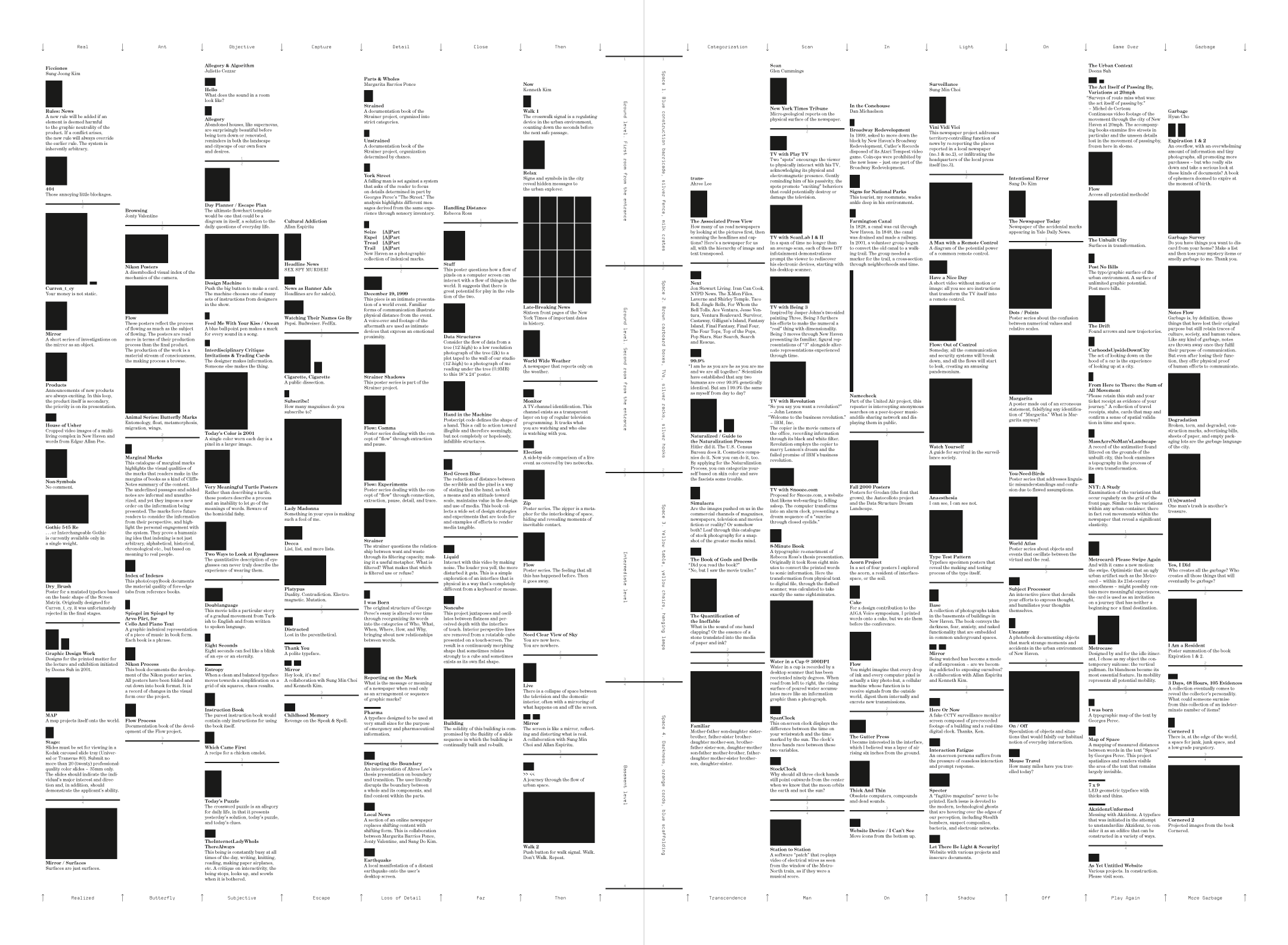
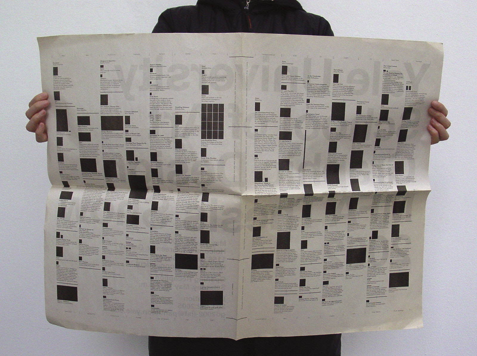
Their first collaboration, the invitation and website for the 2002 Yale graphic design MFA thesis show, paired Sulki's love of diagrams and Min's obsession with invisibility. How does one diagram the invisible? The invitation-as-newspaper catalogued every to-be-exhibited work. However, in place of thumbnail reproductions of the works, relatively scaled black boxes were provided. The sea of placeholders monumentalized the more certain text, encouraging readers to imagine their own version of each work. (This direction may have also been a pragmatic one: perhaps the works had not yet been completely realized by the ambitious graduate students and so were "invisible.")
"When the translation of an idea into visual form is too transparent, it's not so interesting anymore," Min explained in an interview. "We prefer the execution to be slightly unpredictable." This tenet was recently embodied in Sulki & Min's typeface Art Mediums, used on the cover of the 2017 edition of A.i.A.'s Annual Guide. Like any typeface, it's composed of individual characters. But Art Mediums goes further: each character is itself composed of words—specifically, words that describe materials, processes, and techniques used to create a work of art. Looking more closely, I was surprised to recognize that the words are rendered in Comic Sans, a ubiquitous, casual typeface often critiqued for its unsightly appearance in situations formal or serious (one particularly egregious, and controversial, example: a World War II memorial in the small town of Geffen in the Netherlands). By embedding content within the typeface, Sulki & Min suggest that there is no such thing as a neutral typeface: even the omnipresent Swiss typeface Helvetica, praised for its clarity and designed to have "no intrinsic meaning," has a particular history and many cultural ties to modernism. Sulki & Min simply made the story of Art Mediums more obvious; Comic Sans injects it with richer and stranger connotations.
"Artists who spend most of working time on graphic design, or vice versa," reads Sulki & Min's Twitter bio. While they do projects mainly for cultural institutions—such as the Seoul Museum of Art; Arko Art Center; Plateau, Samsung Museum of Art; and Asian Culture Center Theater—they also collaborate with curators, writers, artists, and computer coders, and assume these roles as well. Their publishing imprint, Specter Press, founded in 2006, presents monographs and catalogues of Korean artists, translates modernist design texts into Korean, and collaborates with artists to create unique works only possible in book form. As artists, they have had numerous solo shows and are also part of SMSM, an applied art collective devoted to health and happiness.
Sulki & Min's motto, "Clarifying is our business, obscuring is our pleasure," makes plain their desire to shift roles. While this phrase can be understood metaphorically, the duo has a tendency to literally obscure their works. In their recent solo exhibition at Perigee Hall & Gallery in Seoul, titled "Perigee 060421-170513," past design work was translated into heavily blurred digital prints. Here, language melted into pure image. In one piece (Single Source: Poster, Seoul, 2016, 2017), I recognized through the blur their colorful, participatory graphic identity for BMW Guggenheim Lab. The original logo, an empty text frame, was updated in real time with ideas from the public about what a city should be. Numerous screenshots of the original logo taken at different times, available on their website, highlight the logo's mutability. When viewing these, my focus shifted from the screenshots to the site's gray background, which I noticed was subtly flickering. While content usually takes center stage online, Sulki & Min treat traditionally ignored elements as opportunities.
Sulki & Min are diligent and discerning archivists of their own work. Their website currently presents 538 different works from 2001 to the present. These "outcomes" include "books and non-books, posters, printed ephemera, websites, periodicals, identity systems, installations, videos, environmental graphics, typefaces, exhibitions, performances, and miscellaneous items." For older web-based works, Sulki & Min provide links to self-hosted "archived websites" since the original sites, fetched from the clients' servers, are no longer available due to a later redesign—or maybe a forgetfulness in paying the hosting bill. In this way, Sulki & Min take ownership over a project once it is "over." And in place of photographic documentation of their print projects, common for portfolio websites, Sulki & Min often present screenshots of the "score," the images created on-screen before being sent off to be "realized." Designers frequently let their clients act as the primary distributors of their work, but Sulki & Min take matters into their own hands. Through carefully presenting and preserving their work, they equally serve as distributors, especially for distant audiences.
In their explanatory note printed on the last page of the Annual Guide, Sulki & Min note that Art Mediums is still "in development." Usually, printed work is presented as final, so this statement made me curious: Will the typeface be updated yearly as possibilities for creating art increase through advances in technology? Will Sulki & Min eventually add these new "outcomes" to their website? Where are art mediums going from here, anyway? Sulki & Min's evolutionary approach, although evident in all of their projects, is most embodied by their living website. Instead of simply letting their works speak to their practice, the designers encourage sustained attention from viewers, and are best understood through observation over time.