The assignment was straightforward: I asked students in my interactive design class at Yale to follow someone on Twitter and then create text-and-image versions of 60 of that someone's tweets.
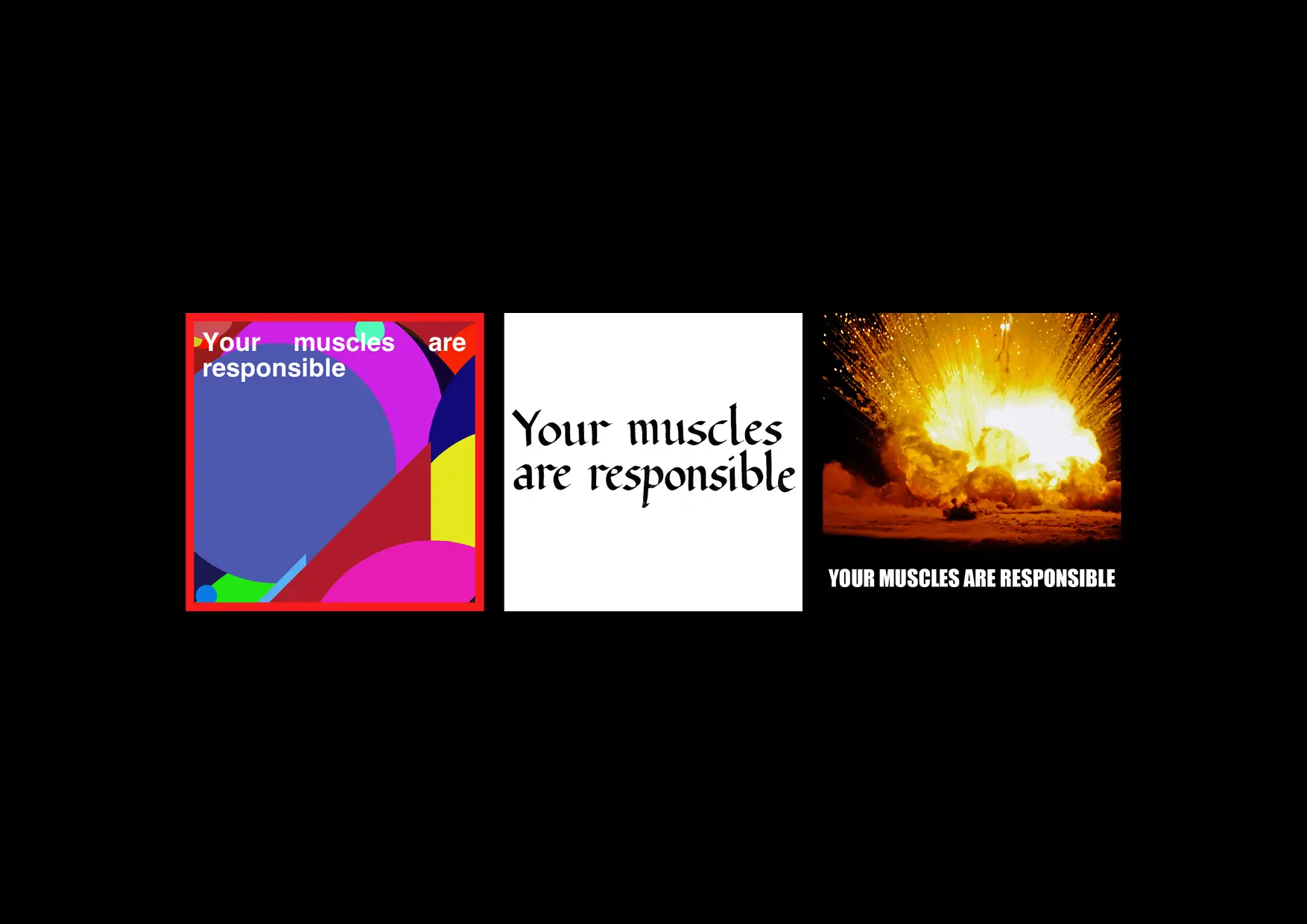
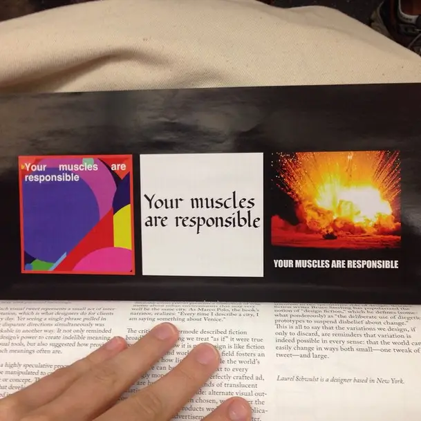
Among the hundreds of these "visual tweets" I received, three illuminated the same enigmatic phrase: "Your muscles are responsible."
The line came from the infamous @horse_ebooks, a hugely popular Twitter account that spewed random fragments apparently culled from a trove of digitized literature. (Until the humans behind it revealed themselves last year, the account was widely believed to be a spambot gone haywire.) One student superimposed the seemingly computer-generated text onto a background of computer-generated abstract imagery, another used the assignment as a chance to practice traditional calligraphy skills, and the third rendered the text in the visual idiom of Internet memes.
Like a snippet of readymade poetry, the line is oddly evocative. My muscles? Responsible for what? It's easy to imagine Twitter users from all walks of life filling in the blanks, overlaying the text with personal meanings.
Each visual tweet represents a small act of interpretation, which is what designers do for clients every day. Yet seeing a single phrase pulled in three disparate directions simultaneously was remarkable in another way. It not only reminded me of design's power to create indelible meaning with visual tools, but also suggested how provisional such meanings often are.
Design is a highly speculative process: endless variables can be manipulated to create endless versions of an image or concept. The more experimental or wild ideas that develop in the studio, however, are often discarded in the march towards a singular visual outcome. The criteria for judging this tends to be fluid and subjective, hashed out in negotiations between designers and clients. Seasoned designers are careful to show a few select directions, or sometimes only one.
In the case of a logo or corporate identity, the singular outcome decided upon becomes a powerful and lasting representation of an organization. It's supposed to be stable and consistently recognizable. Even the charming Google Doodles, riffs on the search engine company's logotypes that accompany holidays and special occasions, still reflect a single core idea about the company's omnipresence. But what happens to the fully realized alternates that we create and then discard? They are not activated in the world, yet I like to think that each invites a powerful imaginative leap, conjuring a parallel universe in which a parallel visual culture flourishes, one filled with pink IBM logos and Pineapple computers.
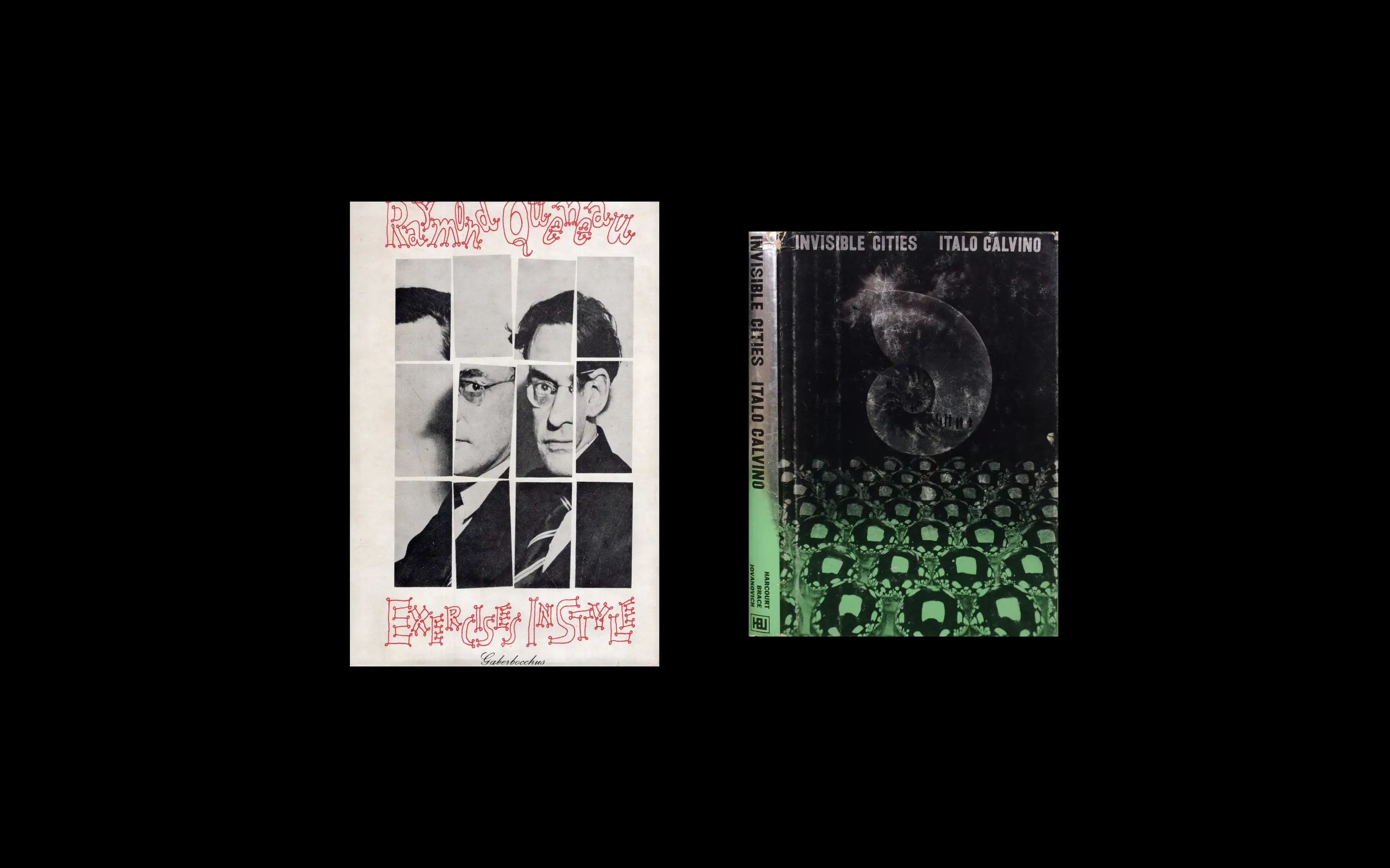
Designers tend to compare themselves to their peers in fine arts, for the simple reason that both fields traffic in visual experience. Yet it's often more productive for me to think about my work in relation to fiction. One key text is Raymond Queneau's Exercises in Style (1947), which narrates a simple encounter on a bus 100 times, each in a different style that alters—subtly or radically—how we understand the basic story. Italo Calvino's Invisible Cities (1972) presents a collection of fragments about urban environments that may very well be the same city. As Marco Polo, the book's narrator, realizes: "Every time I describe a city, I am saying something about Venice."

The critic Frank Kermode described fiction broadly as something we treat "as if" it were true even when we know it is not. Design is like fiction in that sense, and working in the field fosters an awareness of how light and flexible the world's appearance can be. Hovering next to every seemingly monolithic logo or perfectly crafted ad, there are hundreds or thousands of translucent variations that were cast aside: alternate visual outcomes that, had they been chosen, would alter the way we relate to the products we buy, the publications we read, the advertisements we encounter, the brands we share oxygen with.
We can experience this lightness when we travel. The banal items—toothpaste, newspapers, salt—that make up everyday life have all been delightfully reimagined. As we acclimate to the foreign quotidian, our everyday world back home becomes ghostly. Traveling then trains us to speculate: a new color or typeface easily sets a mind into spirals of "what if."
Sometimes we are forced into a possible future. In 2012, major websites protested the proposed Stop Online Piracy Act (SOPA), worried about the restriction of free speech online. The websites "blacked out" their content for a day to show the heavily censored, post-SOPA internet of the future. Instead of a charming Doodle, Google's logotype was covered with a censor bar; elsewhere, Wikipedia blocked access to all of its content, directing users to a landing page that asked them to "Imagine a World Without Free Knowledge." The campaign seeped into every facet of my Internet browsing, placing me for 24 hours in a parallel world of redactions and blocked access.
Broad momentum is building for giving more attention to this speculative side of design. Science fiction writer Bruce Sterling has popularized the notion of "design fiction," which he defines (somewhat ponderously) as "the deliberate use of diegetic prototypes to suspend disbelief about change." This is all to say that the variations we design, if only to discard, are reminders that variation is indeed possible in every sense: that the world is flexible, easily changing in ways both small — one tweak of a tweet — and large.


