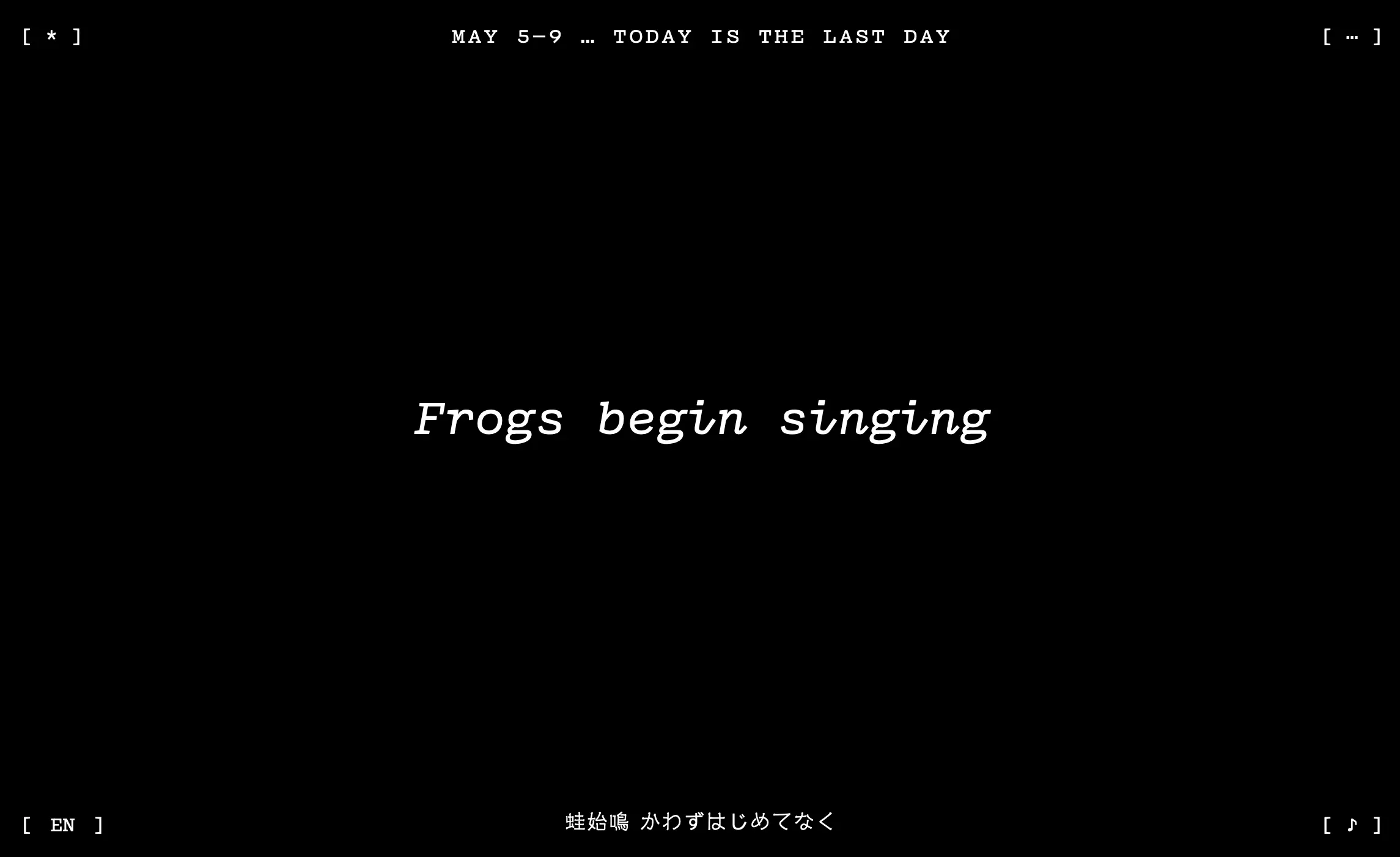
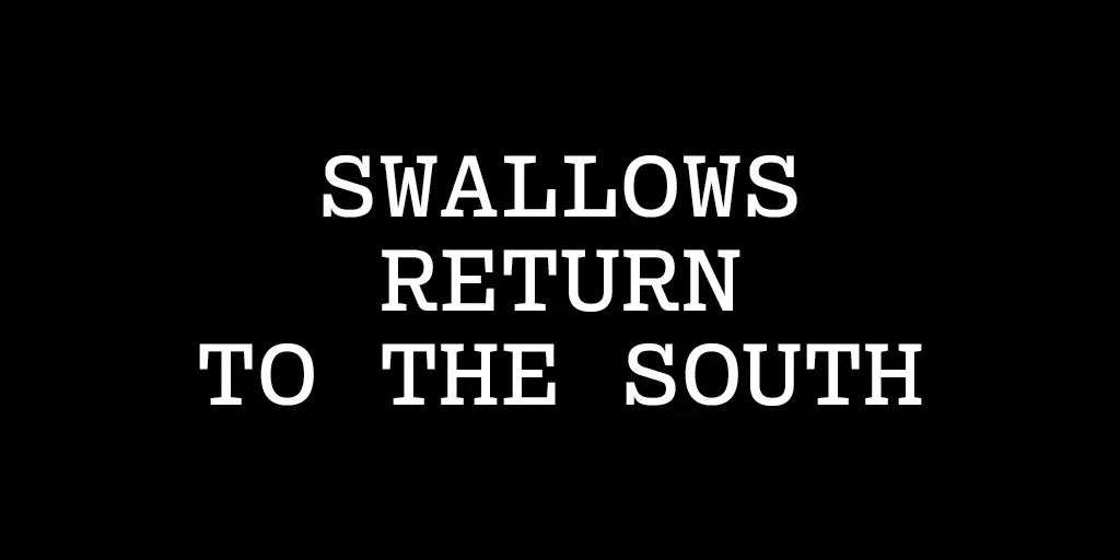
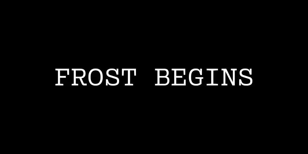
Today (May 9th) is the last day of "frogs begin singing" or 蛙始鳴 —

And it's on this day we're launching the website pentad.world, or "Seasons in Pentameter."
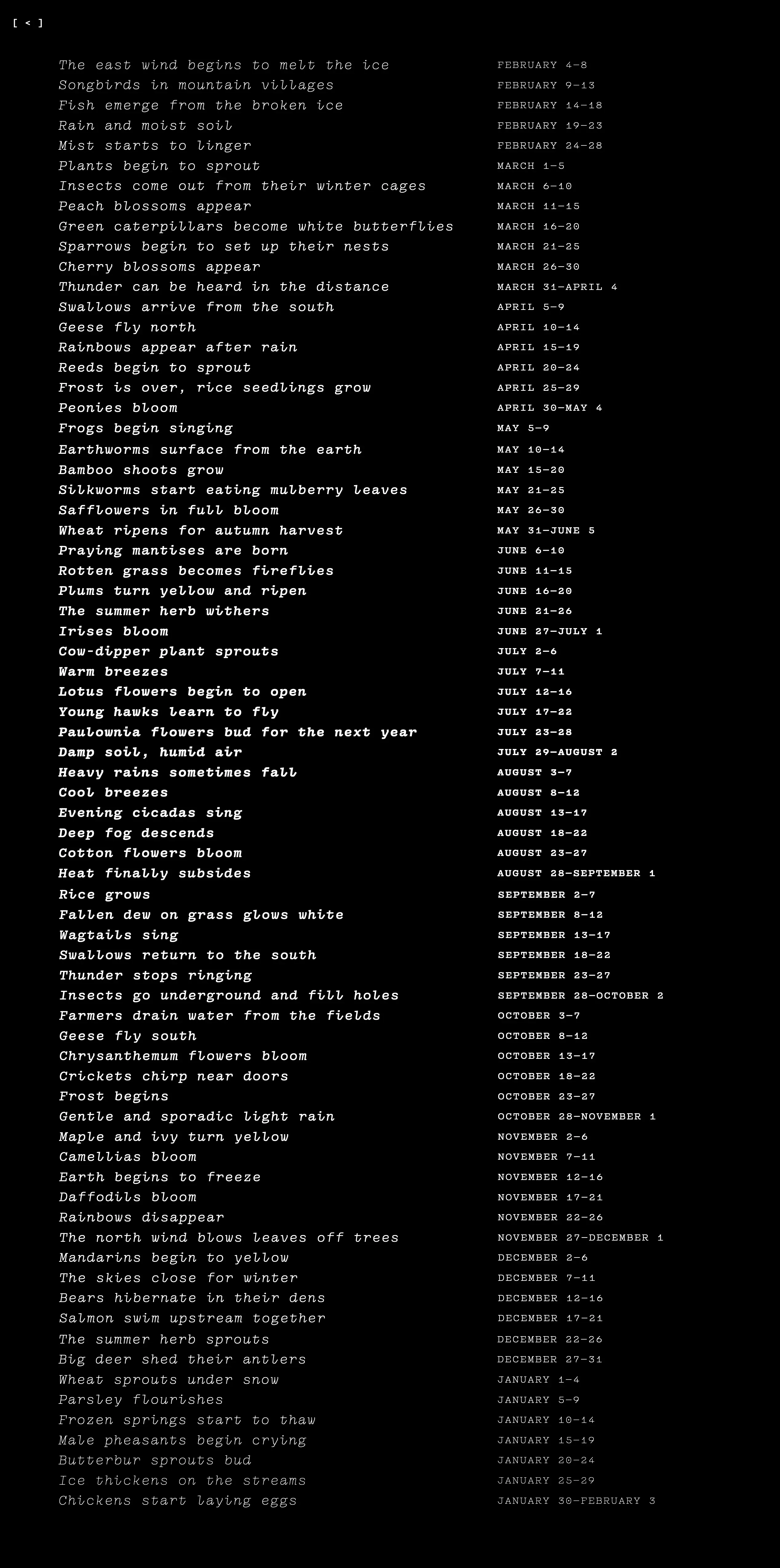
Seasons in Pentameter presents the 72 microseasons (kō) of Japan, each lasting five days. Also called the 72 pentads, they originated in China and were adapted to better match the seasonality of Japan, where they were rewritten in 1685 by the court astronomer Shibukawa Shunkai. As described by nippon.com, "In their present form, they offer a poetic journey through the Japanese year in which the land awakens and blooms with life and activity before returning to slumber."
This project began late last year, when designer and programmer Marie Otsuka emailed me, asking if I'd be interested in making a website to showcase her font "Pentameter," published by Occupant Fonts. The font Pentameter blends the precision of monospace with the expressiveness of handwriting — while also being variable.
I enjoyed learning that the inspiration for Pentameter began with the "Poetry in Motion" public arts program that places poetry in various modes of transportation across cities. Marie shared, "Whether on the bus or subway, I've always loved seeing a poem where I might normally see an advertisement." The font Pentameter similarly blends utility with expression.

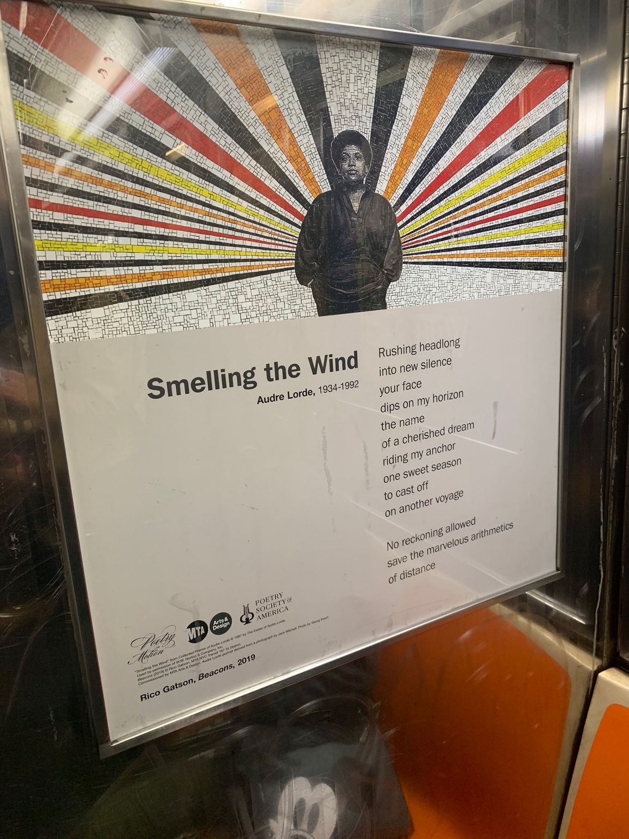
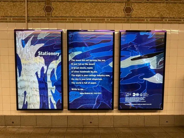
The “Poetry in Motion” series is mostly in print — seen as posters inside subway cars. Most recently it’s also on digital displays on subway platforms.
Experiencing “Poetry in Motion” poems on public digital displays made me curious: How could a poem truly take advantage of the possibilities inherent within digital and networked space to extend its poetic voice? And how could this poem, displayed on a public kiosk, simultaneously be useful to its public, in its particular place? I was also exited to show Pentameter, this new font, in a way that conveyed both its spirit and breadth.
I recalled websites (which are inherently “open to the public” in terms of access) that, like “Poetry in Motion,” similarly present something poetic … but also change over time. I remembered a couple of them:
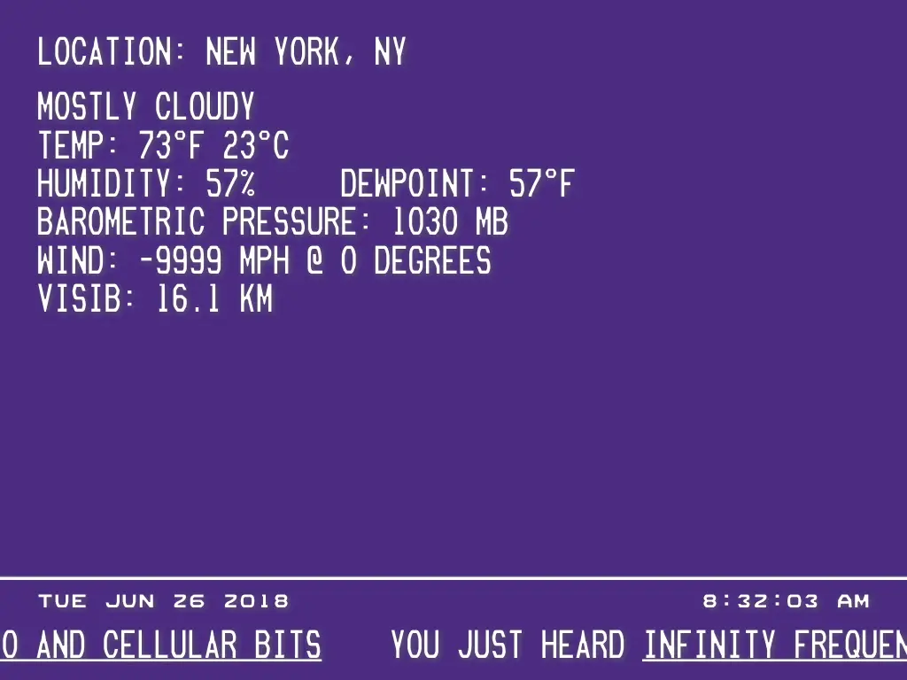
The late currentcondition.org (RIP) is a mysterious, calming, and useful website made by artist Miles Huston in 2014. It’s recently gone offline, but for over 6 years it streamed meditative yet energizing music while also displaying environmental and novel data from a variety of sources: the current weather and time around the world as well as video streams from Niagra Falls and Panda Cam, to name a couple. Trendhunter.com reports, “Very little is known about the site, which has only a main page and no information about its creator. Nonetheless, its theme seems to center around the environment.”
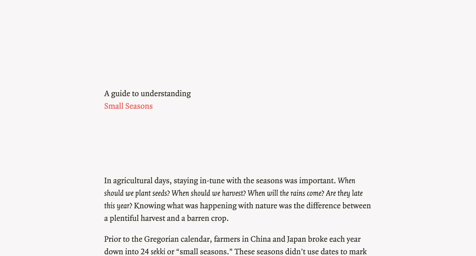
Another website that changes over time and also provided foundation for our own project is smallseasons.guide, created by designer Ross Zurowski in 2017. It clearly and simply presents the 24 small agricultural seasons or sekki (which the 72 kō stem from — there are 3 kō inside each sekki). Zurowski explains, “Living in cities, most of us don’t need to know if the rains are late this year, or when the bushwarblers will start warbling. But it’s nice to have a more fine-grained way of thinking about the year.”
Marie Otsuka’s Pentameter is a variable font, which can change thickness, slant, and wideness based on mathematical properties. The first time a “variable font” really got implanted into my memory was in 2012, through watching Dexter Sinister’s video “Letter & Spirit” at MoMA’s Ecstatic Alphabets show. The video, which is a companion to the essay, presents a meandering tour & history of type design, leading up to the variable “MetaFont” by mathematician Donald Knuth. "The utility of parametric variations comes from mankind’s need for variety," shares Knuth, who also believes, like good background music, "A font should be sublime in its appearance but subliminal in its effect."
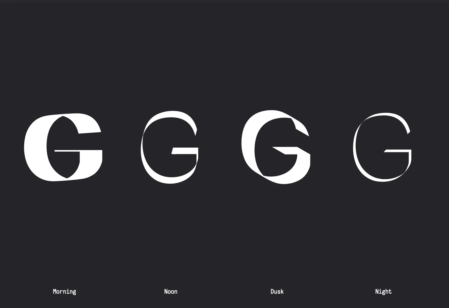
The design studio Linked by Air has invented dynamic graphic identities using variable fonts that change depending on time or season — like the identity for Columbia GSAPP, whose typeface evolves depending on time of day, or the changing type treatment for Aspen Art Museum, whose “website uses a different font weight each season, so that it appears robust in the spring and summer, emaciated in the winter.”


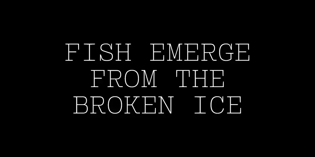
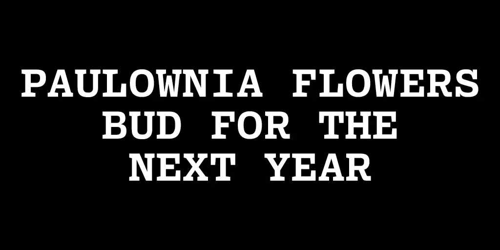
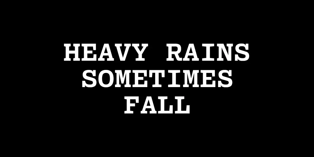
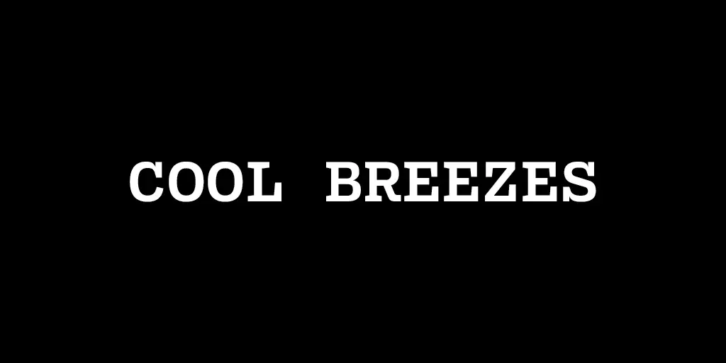
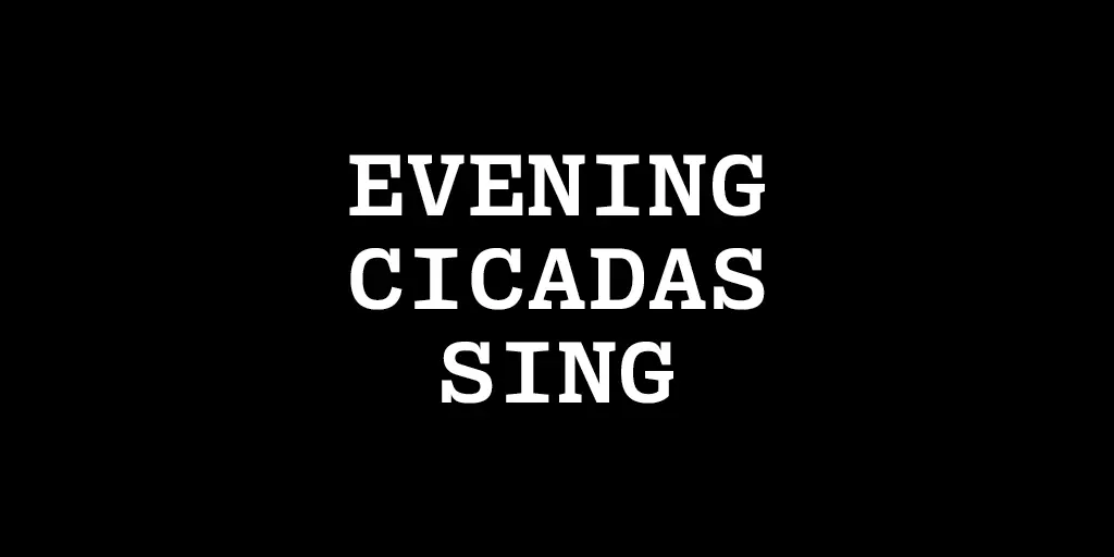
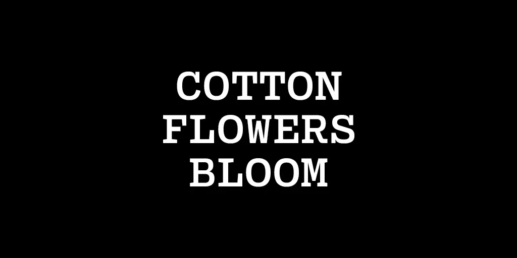
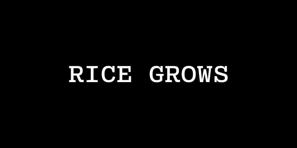
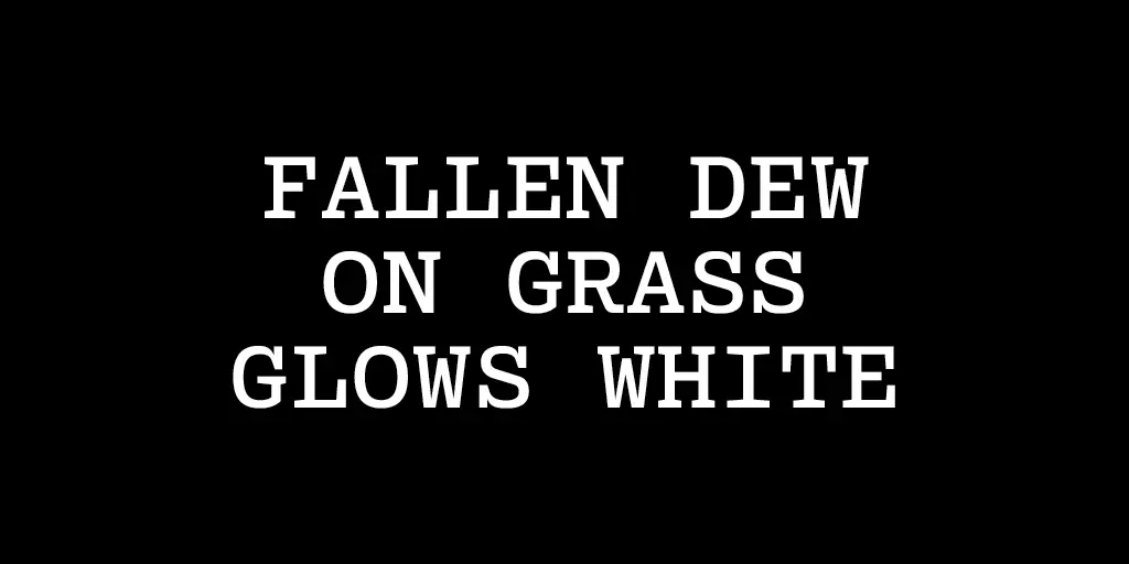
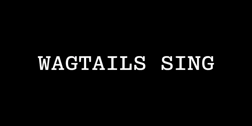
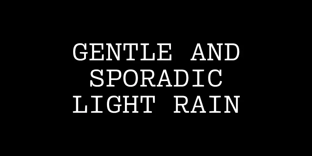
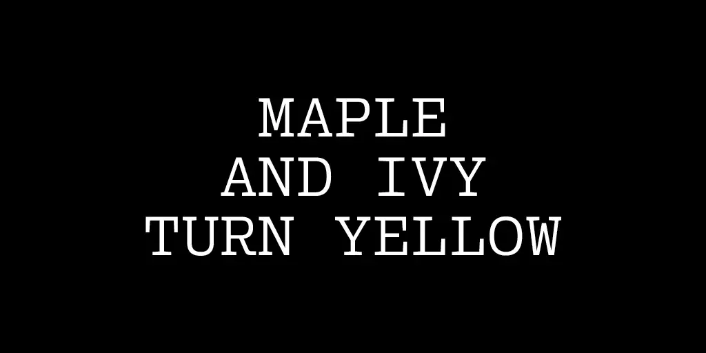
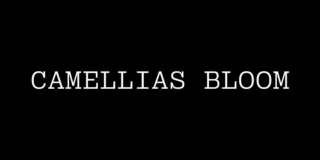
We took a similar approach with our seasonal mapping of font weight. The thinness of the “Fish emerge from broken ice” feels fragile and wintery (February 14–18), while “Evening cicadas sing” is literally thick and heavy, like the unrelenting summer humid & warm air when the cicadas are their loudest (August 13–17).

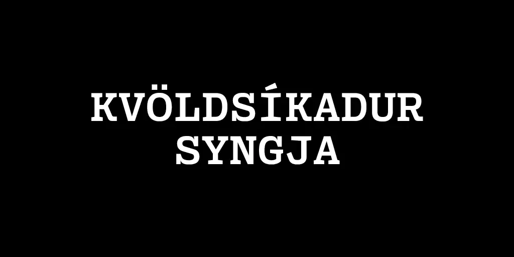
One other aspect of Pentameter I was excited to show was its capability to be used in up to 47 different roman languages, with all their various diacritic marks. Above is the Icelandic translation of “Fish emerge from the ice” and “Evening cicadas sing.” Even though I don’t personally know Icelandic, I still get a general feeling for the content through the font weight.
This “tone mapping” reminds me of a writing exercise I’ve shared with students and friends (which was originally shared with me by a friend — Sara Knox Hunter).
Find a poem that you can’t read or understand. (It should be in a language you don’t know.) Translate the poem without using any translation tools (like Google Translate). Use your understanding of repetition and visual grammar to “translate” the poem.
Ideally, participants find themselves in a dream state because even though they’re writing a new poem, their focus is on mapping their words to the original, or “translating” it.
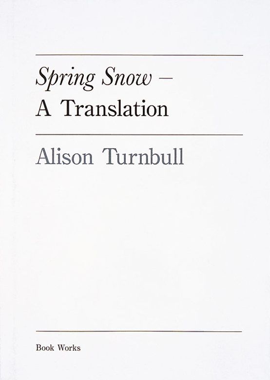
When first coming up with how to present the kō, I first considered using colors instead. I was reminded of a small art book, Spring Snow — A Translation by Alison Turnbull, who presents Yokio Mishima’s novel Spring Snow into colors, divided by chapter. The publisher Book Works describes, “Drawing on Mishima’s evocative use of colour in the novel, Turnbull condenses the narrative into a colour palette. Working from the English edition, she isolates and orders each of the more than six hundred colours as they appear in the text − what emerges is a visual essay on the nature of translation.”
“Serpentine” is the name of a fragrance made by Comme des Garçons. As part of the project Perfume Area (with Sydney Shen), we reviewed Serpentine in 2015. In the above video, artist Damon Zucconi’s “voice” reads aloud our perfume review. “The voice is synthetic and has no texture but is instead composed of phonemes that are pure sine waves.” In this way, it’s an auditory translation of the words as material.
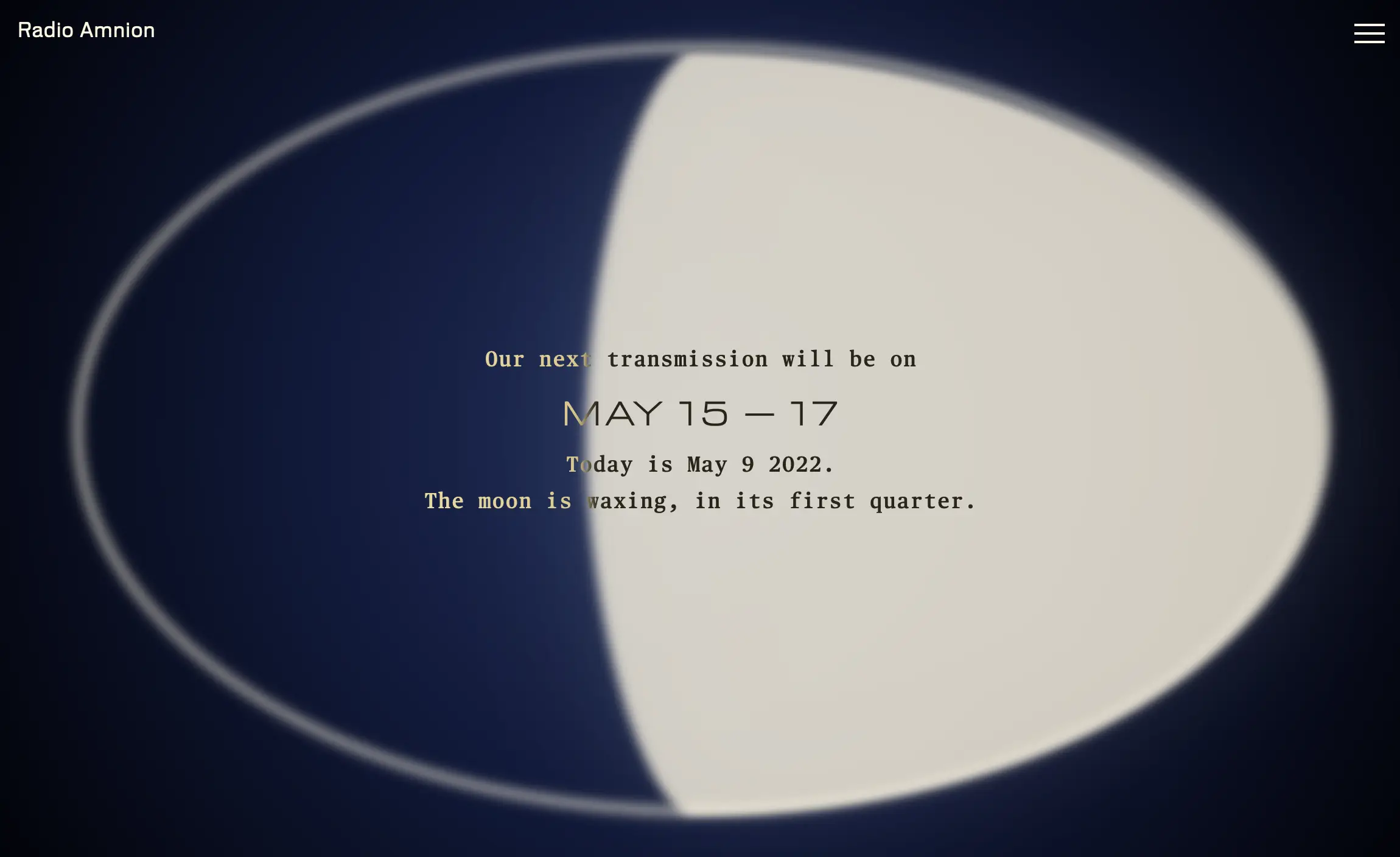
Also working with the materiality of sound, the project Radio Amnion broadcasts new sound commissions by contemporary artists into the Pacific ocean through a submerged neutrino telescope each full moon. During this time (for three days around the full moon), these artistic sonic transmissions are also available on its website, which also changes visually depending on moon phase. (The website was also co-designed & developed by Marie.)
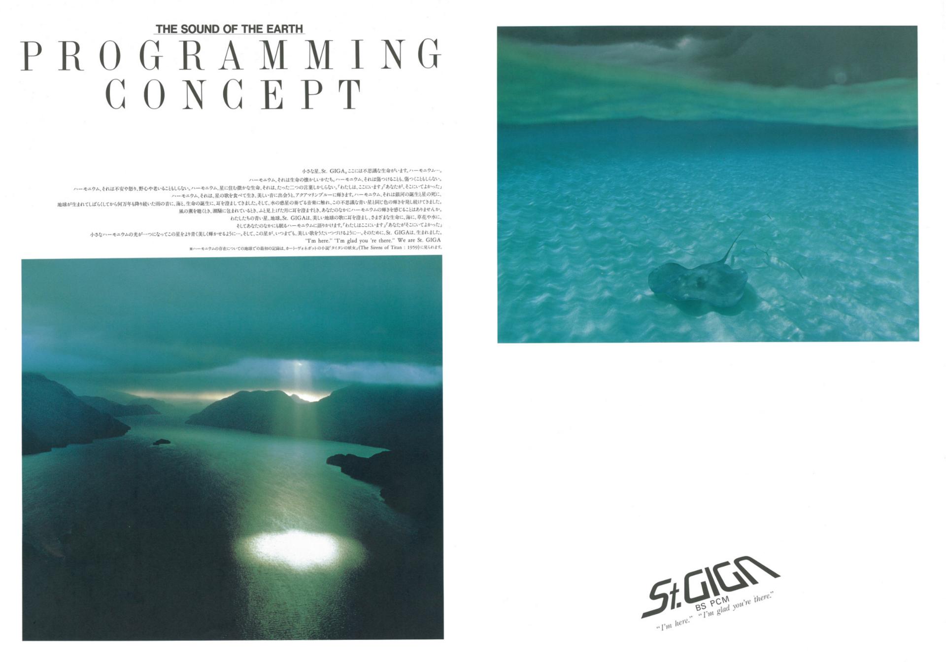
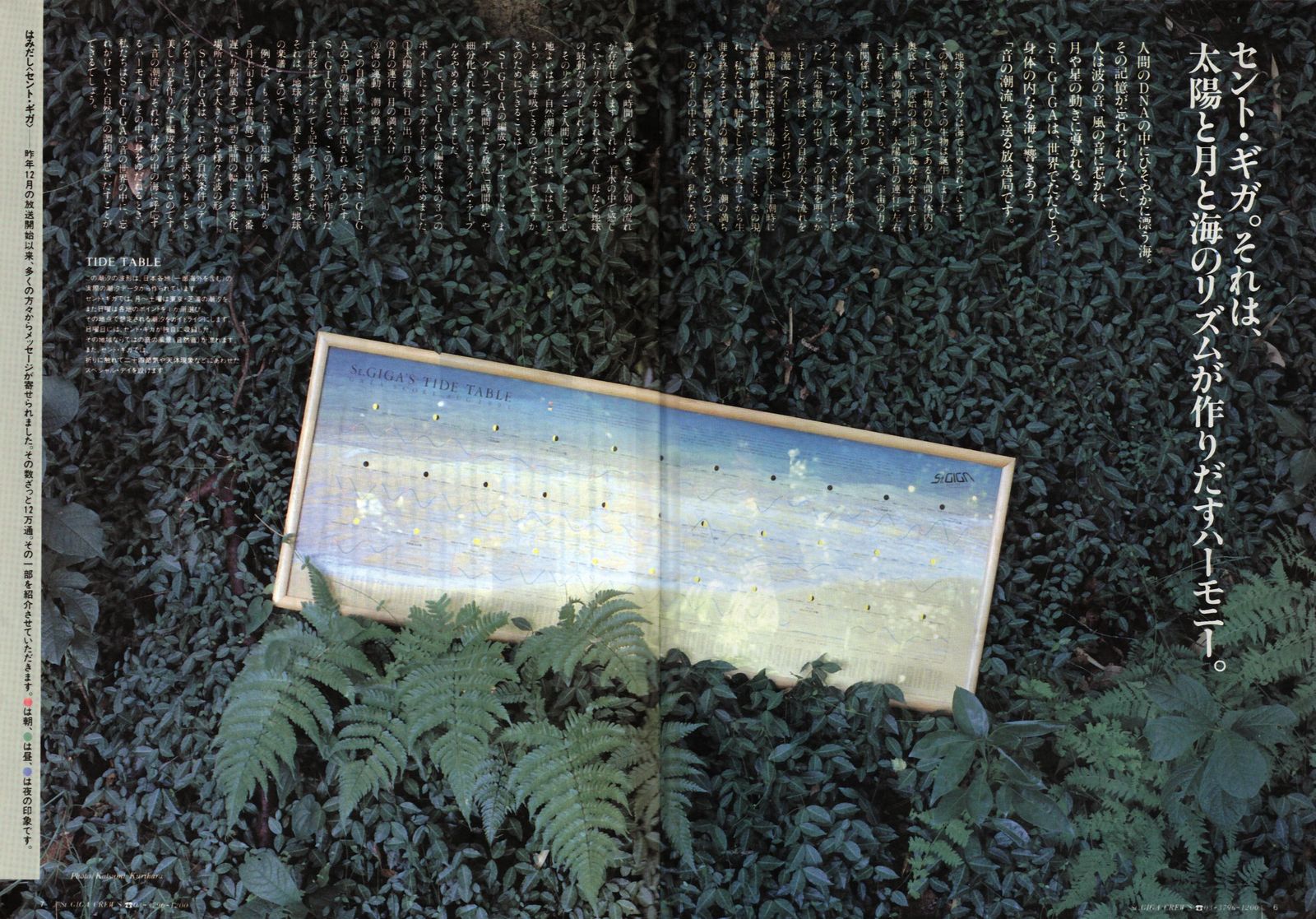
Another sound project scheduled in accordance with the moon (well, the tides) was St. GIGA, the world’s first digital satellite radio station, begun in 1990 in Japan and directed by Hiroshi Yokoi. Researcher & musician Justin Patrick Moore writes, “Themes for broadcasts were based on a cyclical motif and tried to approximate the current tidal cycle according to the Rule of Twelfths throughout a 24-hour day. … Using the Rule of Twelfths songs of one genre would flow into and intersperse with songs and material from the prior genre until the new genre, just like a high or low ocean tide, became predominant. Yokoi designed it this way so that listeners could relax into waves of sound ‘like a baby sleeps in the womb.’”
Train stations in Tokyo have unique jingles per station. It’s useful especially if you’re asleep on the train, as wordless jingles can mean something to your nervous system and memory, waking you up maybe more easily than a monotonous voice sharing the station name alone.
The above video celebrates the sound aspect of our project, taking you through all 72 kō. Each commissioned five-second jingle composed by Tiger Dingsun plays per microseason.
Tiger created the jingles by taking the entire corpus of the kanji used in the names of the 72 microseasons, sorting them into categories (i.e. crops, flowers, birds, weather), and then assigning each category a particular instrument. Each microseason, which has a name 3-4 kanji long, thus corresponds with a loop that consists of 3 or 4 layers. Each loop is 5 seconds long, so that if one were to listen to the entire year, it would take 365 seconds.


Circling back to “Poetry in Motion,” the 72 seasons enchants us and then helps us be attuned to the fact that the world is constantly in motion; to pay attention to the smaller changes as the earth revolves — how all species depend upon it.
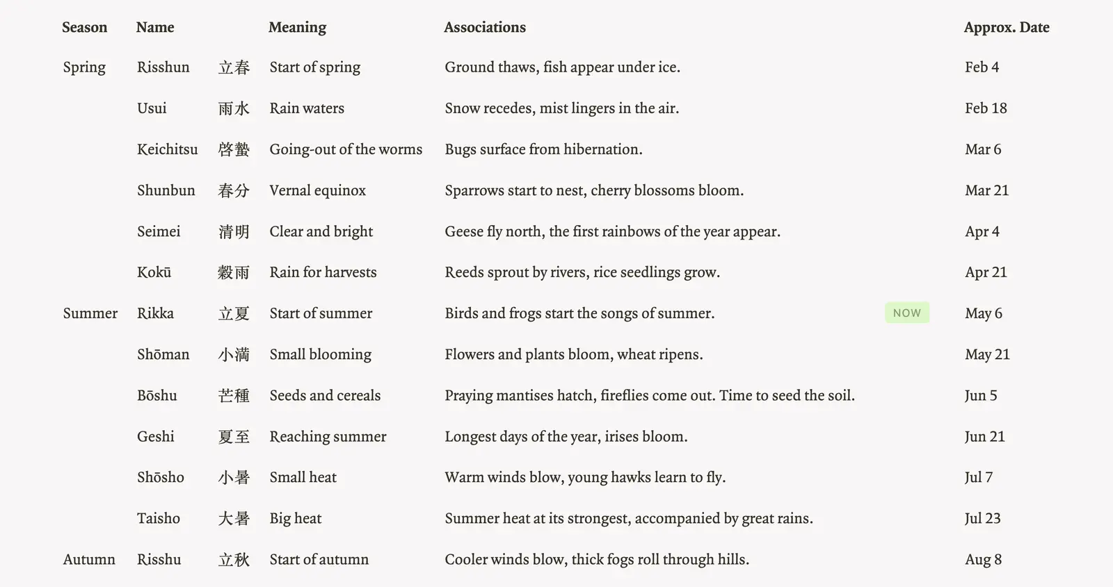
The microseason we’re currently in at the time of my writing — “Frogs begin singing” is actually the first of the sekki “Rikka” 立夏 or “Start of summer” — midway through the spring equinox and summer solstice. As the 72 Seasons app puts it, “The cold mornings and evenings abate, and the animal world begins to get active as summer approaches.” This app simply updates every five days, sharing information about the microseason itself and its corresponding seasonal expression, vegetable, fish, flower, and activity.
| frogs begin singing — 蛙始鳴 ... May 5–9 | |
| expression | "iris bath" |
| fish | white croaker |
| vegetable | garden peas |
| flower | carnation |
| activity | growing morning glories |
I’ve been imagining how the 72 seasons could exist in a public space, like on the subway. For one, I can picture these changing seasonal recommendations as bold and clear images. I can imagine riding home underground on the subway, after a day of activity, emerging aboveground having learned what the in-season foods were, and then going home and cooking a nice meal with them!
But the microseasons should maybe be even more embedded — like so many of the other mediums in the references described on this page which take a secondary, background, more subliminal role to the “content” — like a font or background music. Maybe the sound for entering the ticket area of the subway could change per microseason, for example.
These microseasons act more as a symbol of ongoing change than an accurate depiction of changes. They may not make sense in places outside Japan, and even in there, they may no longer be accurate markers. In the way that Shibukawa Shunkai adapted them from the Chinese originals back in 1685, we might adapt them to our own microseasons, relative to our particular place, time, and history.
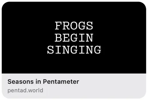
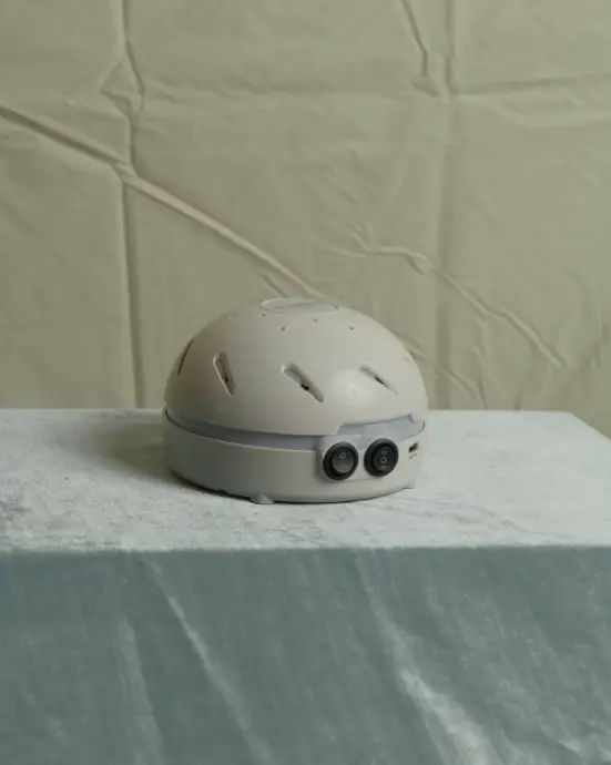
If you share pentad.world — you’ll see the image that represents the site gradually changing depending on microseason. Technically, this wasn’t straightforward to accomplish, as Marie had to set up a separate server, bringing up new questions. We decided to set the server’s time zone to Japan’s, so the image will always reflect the “season on the server.”