January 6, 2020 —
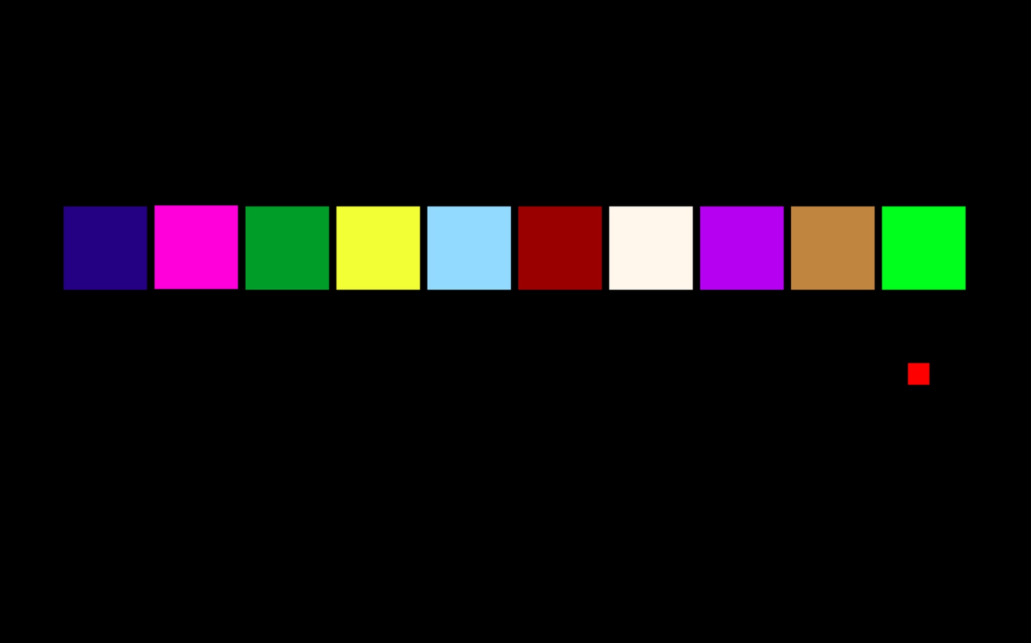
It’s a daunting task to boil down the past ten years of the internet into only ten colors. But I’m a web designer… who began working professionally in 2010… so I choose some memorable colors directly from websites I’ve designed these past ten years… and I’ve also included some favorites from our collective screen-based unconscious.
Below, colors are displayed as hex codes, RGB values, and with their approximate Color Chat name (based on the xkcd color survey). Special thanks also to web colors (x11 color names used in CSS) and the Web Safe 2k16 literary project.
Part 1.
human connections, group therapy, friendly openness, optimistic antidote, remembering water

#081866
rgb(11, 0, 128)
saint patrick blue
The hyperlink isn’t completely dead (yet). On https://wikipedia.org, blue links continue glowing with mystery—this specific midnight blue is the site’s visited link color. http://craigslist.org also still sports the blue hyperlink—its main navigational beacon. The http://are.na logo blue is nearby—two stars purposefully connected by humans. And quite similar is the night mode on http://artistsspace.org, activated after New York City’s sunset, conveying unknown depths, but still welcome to… and built by… conscious humans. Which reminds us of realms they haven’t yet explored fully… the deep ocean, outer space, and sleep.

#ff00dd
rgb(100, 0, 85)
brilliant orchid
More rarely seen online, pure RGB magenta vibrates like no other. This is why I chose it for easily glossed over but important metadata on the first site I ever designed as a professional (while working at the studio Linked by Air), http://artasiapacific.com, launched in 2011. It was around then, as a new New Yorker, I first visited http://www.melafoundation.org, La Monte Young and Marian Zazeela's “Dream House.” Add a little more red, and you have http://printedmatter.org’s warm pink #e90c8c or the brand color of https://www.sweat.com, one of the most popular fitness apps whose brightness glimmers in the periphery at the gym while also quickly devouring the battery of its mobile device host. Indeed, magenta can symbolize a “letting go.” Maybe it’s about communing with a group that has some higher calling.

#228b22
rgb(0, 62, 16)
forest green
It’s a friendly green, an open green. It’s been the background of my own website, http://laurelschwulst.com, for a long time, mostly because in CSS its nickname is forestgreen. It’s close to the color of an “open block” on http://are.na, meaning anyone is welcome to contribute. It’s both close to yet far off from Google’s green (which it showcases in its logo’s lowercase “L”… #00b156) but with a significant amount of blue mixed in, it’s hard to tell what type of plant it comes from.

#fffd55
rgb(95, 100, 20)
banana yellow
I chose this welcoming, bright, yet slightly weird yellow as the background of http://left.gallery, an “app store for files” run by Harm van den Dorpel and Paloma Rodriguez. You are here, and here are the files. Less saturated is the yellow of highways in Google Maps (launched a little before the start of this decade). Yellow tries to show you the way, which makes sense in that it’s also quite close to the yellow inside http://petals.network’s flower logo. Petal is an optimistic antidote, a community garden, or simply a group blog.

#92DAFF
rgb(57, 85, 100)
very light cornflower blue
Although we mostly spend time navigating cities’ complexities within Google Maps, we shouldn’t forget that most of the earth (and most of Google Earth) is water, and that our own bodies are mostly water, too. If we are going to use memes for good this next decade, let’s make water memes (showing that thoughts and feelings affect physical reality) or have water tastings (producing both poetry and hydration). Make this light blue a little more saturated and you have https://twitter.com’s bluebird. (Twitter’s logo shifted from wordmark to bird in 2010.) Recently, Twitter announced @bluesky, its initiative to develop a decentralized standard for social media.
Part 2
warmth in functionality, light and intimacy, surviving usefulness, natural avatars, the tunnel

#9A0000
rgb(60, 0, 0)
falu red
The strangest, most memorable brand color is http://muji.com’s, which is funny because Muji means “no brand.” It’s alive and of the earth. Maybe it’s also the color of dried blood. I’ve probably spent more money in small, regular doses at Muji than any other domestic brand this past decade. While minimalist, Muji products are also warm and friendly. I hope that as we continue going domestic cozy, we also carve out spaces for human-scaled connection and warmth, both in private and public space. Functionality isn’t enough, says designer Naoto Fukasawa, as designs must also have みりょくてき, a “friendly, cute, charming, fascinating” quality.

#FFF6EC
rgb(100, 96, 93)
seashell
It’s the background of http://gossips.cafe, where the coffee is always strong and the vibes imaginative. It’s not too far from Cosmic Latte, the average color of the universe. It’s close to the background of http://www.sweetheartsweetheart.com, Mindy Seu’s digitization of Emmett Williams’ charming, multivalent 1967 concrete poem that you can navigate with your arrow keys, and that of http://cdxs.ist, Becca Abbe’s LLC with stream that shows both process and product. This color also reminds me of https://sfpc.io generally, for its important warm and human approach to computing and education (since 2013)—I remember enjoying all the softly glowing paper lanterns inside its physical space. All the sites and spaces this color touches are light, alive, and social, like having a seashell as a smartphone.

#B500F1
rgb(71, 0, 95)
brilliant violet
The smartphone app “Yo” was released on April Fools’ Day 2014, although originally it was rejected by Apple for being too simple. The app had only one function—you could “yo” anyone else on the app. For a while, I communicated with my parents through Yo exclusively. They could tell I was alive, and I could tell they were too, and that was both fun and useful. A more muted purple is the web’s default visited link color, featured throughout https://www.kickscondor.com, a blog that celebrates the strange, human, living hypertext web. A similar purple lives on https://www.tarabrach.com, a meditation teacher and psychologist, who helped me (and I’m sure many others) into meditation and mental health this past decade. How can we survive usefulness?

#C0853F
rgb(75, 52, 25)
triple puddy
On the internet, plain brown seems to live not as a flat color but in natural avatars or symbols. I’m thinking of three—the anonymous https://po.ta.to, the snail of https://thecreativeindependent.com, and the gleaming brown, galloping horse that represented @horse_ebooks, a hugely popular Twitter account that spewed random but prophetic fragments apparently culled from a trove of digitized literature. Until the humans behind it revealed themselves, the account was widely believed to be a spambot gone haywire. Its last tweet was a phone number; I remember calling that phone number in 2013 and hearing one of their tweets read aloud by a human. Then I learned it was the two artists behind the account speaking at a gallery, which happened to be right downstairs from where I was working at the time. I watched them for a while, picking up the phones and speaking their tweets and then hanging up. I couldn’t believe it—the crazy reveal and my own proximity to this event.

#00FF00
rgb(0, 255, 0)
lime
There is a light at the end of the tunnel, and it’s a bright green pixel. Or is it the beginning of the tunnel? This lime glows as the cover of Rhizome’s Net Art Anthology book, it gleams around the hexagonal logo of https://dat.foundation—a hopeful peer-to-peer protocol, and it gives life to the rebel alliance http://html.energy’s radiating star. I also see it in the “eo” of “videos” on https://billwurtz.com, who went off social media in 2019 but still prolifically answers questions daily through a PHP form on his own website. Add a little more blue to this lime, and it’s https://left.gallery/about’s parallelogram logo or patch of imaginary grass, which slowly breathes if you look at it long enough. What do we think about the internet? We think it’s off to a good start.
Epilogue
A drop of blood
.png)
#FF1407
rgb(100, 8, 3)
luminous vivid scarlet
It’s the pinpoint of Google Maps. You are here. You belong, like http://airbnb.com’s logo (but a little more desaturated). Of course it’s also a notification, like a drop of blood gleaming from a pinprick, calling your attention, but then you remember pain is weakness leaving the body and you forget about it.

